Optimal capacity mix and scarcity pricing
Learning objectives
This chapter introduces a simple pen-and-paper technique that allows us to derive the optimal mix of thermal power plant capacity (such as nuclear, coal-fired, and natural gas-fired plants). It is based on screening curves (introduced in The cost of electricity) and so-called load duration curves. At the end of the chapter, we will be able to:
- Derive the cost-minimal capacity mix
- Derive the cost-minimal annual generation (energy) mix
- Assess the impact of changes in costs, including carbon pricing, on the mix
- Assess the impact of renewable energy on the mix
- Understand peak-load pricing theory
- Understand the “missing money problem”
1. The load duration curve
The previous chapter, The price and value of electricity, introduced short-term electricity market models that helped us understand how power plants are dispatched and how electricity prices are determined. The generation capacity, however, was simply there. In other words, it was an exogenous to the analysis. In this chapter we focus on the investment decision; we make the capacity mix an endogenous variable of the model. We introduce a simple technique that allows us to derive the cost-optimal capacity and generation mix in an electrical system.
Two pieces. To derive the cost-minimal thermal generation mix, we need two ingredients: first, screening curves, which represent the cost of all available thermal generation technologies, which were introduced in the chapter on The cost of electricity. The second is the load duration curve (LDC), which describes the pattern of electricity consumption over time.
Load duration curve. We start with the “load curve” that displays electricity consumption of every single consecutive hour in Germany over a year; Figure 1 depicts an example (Germany in 2010). Typically, electricity consumption is higher throughout the day than at night and higher during the week than on weekends or during holidays, due to human and economic activity. In cool climates, electricity demand tends to be higher during the winter, reflecting the demand for lighting and heating. These electrical systems are called “winter peaking systems”. In hotter climates, summer peaking systems prevail, where air conditioning causes electricity demand to peak on summer afternoons or evenings. Larger power systems tend to feature less demand variability, because the fluctuations of individual consumers cancel out to a large degree. However, even in such systems, the highest and lowest electricity demand during the course of one year can easily vary by a factor of two to three.
Figure 1. German electricity consumption during 2010, displayed in consecutive order
Key point: Electricity consumption varies, with characteristic diurnal, weekly and seasonal fluctuations as well as random fluctuations.
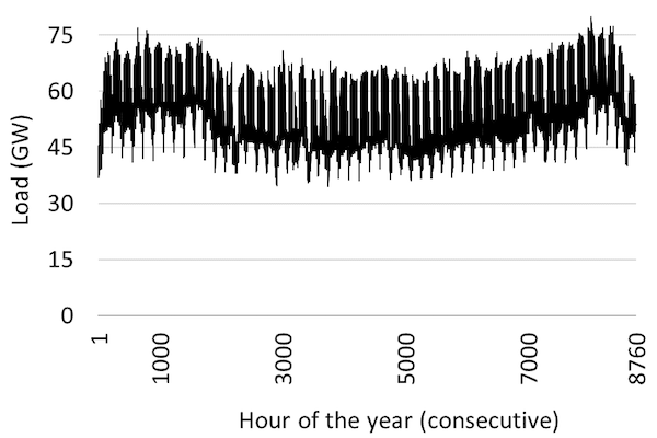
Source: OEE based on OPSD data
The load duration curve. The next step in our analysis is to order electricity consumption by size. Figure 2 shows the same data as Figure 1, just that the hours are ordered by decreasing load. This is the so-called “load duration curve”. One way to read it is to pick a point on the x-axis (say, 3,000 hours) and determine the corresponding load level (about 62 GW). This means that in 3,000 hours of the year, electricity consumption exceeded 62 GW. Another way to read the chart is to pick a point on the y-axis (say, 45 GW) and determine the corresponding number of hours (about 7,500 hours). This means that in 7,500 hours of the year the load did not drop below 45 GW. The extreme left point on the graph indicates that the peak-load during the year was 80 GW and the extreme right point shows that load never fell below 35 GW.
Figure 2. Load duration curve for Germany for 2010
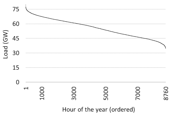
Source: OEE based on OPSD data
2. The optimal thermal generation mix
This section uses screening curves introduced in the The cost of electricity to derive the least-cost capacity mix of thermal power stations such as nuclear, coal-fired, natural gas-fired plants or biomass-fired plants. Note that it is our purpose here to introduce the optimization technique as a method. The underlying cost parameters are chosen to facilitate the graphical analysis and are not necessarily representative of a real-world case.
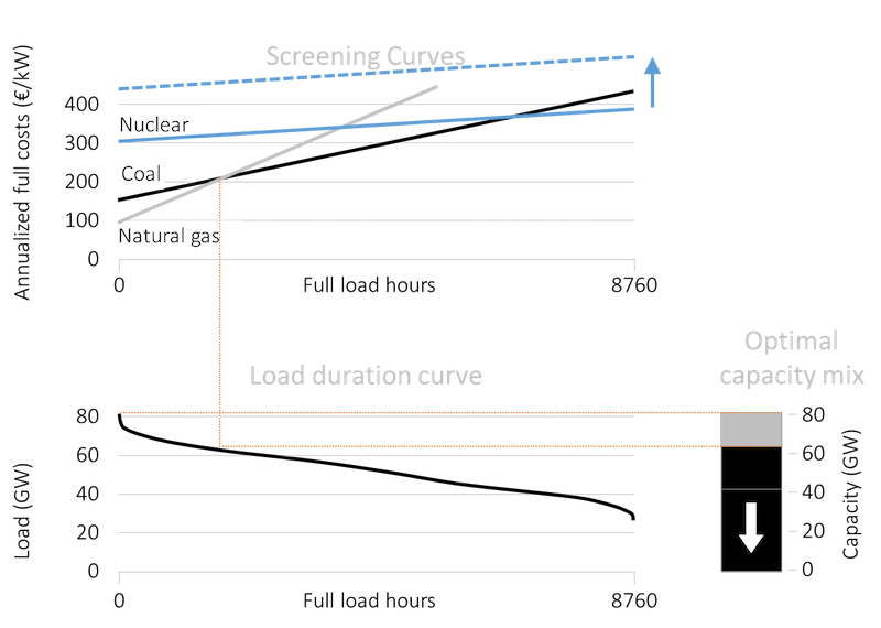
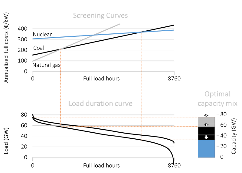
Optimal mix. The least-cost generation capacity mix can be derived graphically by placing the relevant screening curves above the load duration curve so that the x-axes of both figures correspond to each other.
Base load capacity. First, we determine the base load capacity, i.e. the capacity that operates (almost) 24 X 7 for an entire year. Start at the far right of the screening curves’ panel in Figure 3. The screening curves tell us that nuclear power would be the cheapest way to generate electricity when a plant is required to run 7,000 FLH or more, the point of intersection of screening curves of coal-fired and nuclear plants. Next, to determine the quantum of electricity demanded more 7,000 hours in a year, draw a vertical line from the point of intersection onto the load duration curve. The vertical line intersects the load duration curve at a load of about 40 GW. This is the amount of nuclear capacity that should be built.
Mid-load capacity. Proceeding in a similar manner we see that the next intersection to the left in the screening curves panel (between coal and natural gas) is at 2,000 FLH, corresponding to a load level of 65 GW. The difference between 65 GW and 45 GW or 25 GW is the optimal capacity of coal-fired plants.
Peak-load capacity. Natural gas plants are the cheapest options for less FLH. Its capacity is determined by the difference between maximum load (80 GW) and sum of nuclear and coal capacity (65 GW). Hence the optimal capacity of natural gas plants is about 15 GW of capacity. The total of all the different technologies is about 80 GW (40 GW of nuclear plants plus 25 GW of coal plants plus 15 GW of natural gas plants), which is just sufficient to meet the peak-load.
Figure 3. The cost-minimal capacity mix, as derived from screening curves and a load duration curve
Key point: It is cost-optimal to have a mix of technologies.
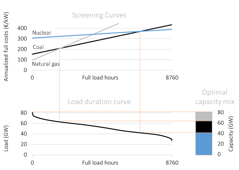
Source: OEE based on OPSD data and illustrative cost assumptions.
A mix is optimal. Let us briefly reflect on this result. We derived that it is cost-optimal to deploy a set of different technologies simultaneously to produce electricity in spite of one technology clearly being cheaper than others. Remember that our analysis started from scratch so the reason for this finding cannot be the existence of incumbent plants. In almost any other industry, using the cheapest production process would be a cost-optimal way to meet demand and, if you could optimize from scratch you would employ only this one efficient technology. In these industries presence of different production technologies usually reflects hedging in face of uncertainty or legacy production techniques. This is not what drives technology differentiation in case of electricity generation. In case of electricity, it is the combination of non-storability and varying load (that must be met at each moment in time) that results in a whole range of different technologies being cost-efficient.
Optimal generation mix. What is the generation (in TWh) corresponding to the optimal capacity mix derived above? The area beneath the load duration curve gives total electricity consumption (and, hence, generation) during the year. The optimal generation corresponding to each technology is a subset of this area. For example the striped area in Figure 4 represents the optimal annual generation of electricity from nuclear power and the dotted area shows the generation from natural gas-fired plants.
Figure 4. Generation from nuclear plants (striped) and natural gas-fired (dotted)
Key point: Areas represent optimal level of generation with each technology.
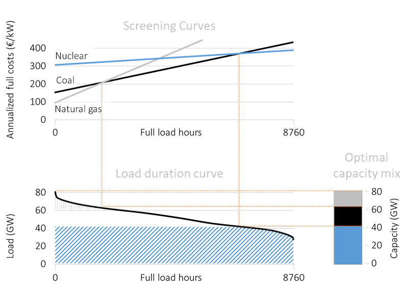
Source: OEE based on OPSD data and illustrative cost assumptions.
3. The impact of cost changes
How does the capacity mix alter when the cost of different technologies or the pattern of load changes? Let us first consider the impact of change in costs using two examples: an increase in the investment cost of nuclear power plants (that increases the fixed cost) and introduction of carbon pricing (that increases the variable cost).
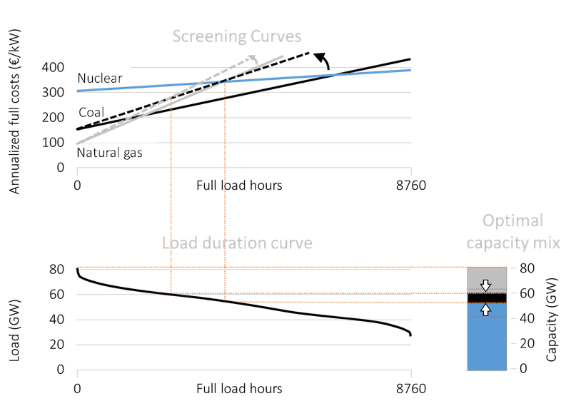
Increase in fixed cost. In recent years, many nuclear power plant projects have witnessed massive cost overruns. An infamous example is Finland’s Olkiluoto 3 power plant, the first of the new European Pressurized Reactor type, which is now expected to cost closer to EUR 8.5bn instead of the initial estimated cost of about EUR 3bn. How does a revision of cost play out in the optimal capacity mix? Figure 5 illustrates this case. An increase in fixed costs results in an upward shift of the screening curve of nuclear power, while all other curves remain unchanged. Note that the slope of the nuclear screening curve does not change, as its variable costs are unaffected. In this example, nuclear power is more expensive than coal even at 8,760 full load hours. As a consequence, coal replaces nuclear in the long-term optimal capacity mix, which now comprises 65 GW of coal capacity and an unchanged 15 GW of natural gas capacity.
Figure 5. Optimal capacity with increased cost of nuclear power
Key point: Nuclear is no longer competitive after the increase in cost.
Source: OEE based on OPSD data and illustrative cost assumptions.
Increase in variable cost. In the past decades several jurisdictions have introduced prices on the emissions of CO2 from power generation, including several U.S. states, a number of Chinese provinces and cities, and the European Union. Figure 6 shows the impact of introducing such a price on carbon. The cost curves of fossil fuel-based technologies rotate counter-clockwise. Further, the cost curve of coal rotates more than the natural gas curve because coal is more carbon-intensive. As a consequence, coal loses market share vis-à-vis both natural gas and nuclear. By putting a price tag on emissions, the dirty fuel coal is squeezed out. An even higher carbon price would lead to coal not being competitive at all.
Figure 6. Optimal capacity with introduction of a carbon price
Key point: The share of coal in the optimal capacity mix declines.
Source: OEE based on OPSD data and illustrative cost assumptions
4. The impact of renewable energy
In determining the optimal capacity mix, using screening curves of each technology, we only considered thermal generation technologies. This is because the screening curve technique works only for thermal technologies (so including biomass would be straightforward). It does not work for variable generation such as wind and solar energy; neither does it work for hydroelectricity. Calculating the optimal capacity mix, taking into account such renewable technologies, requires us to use more complicated computer models. But the method described above can be used to understand the impact of introducing wind and solar energy on the cost-optimal thermal plant mix.
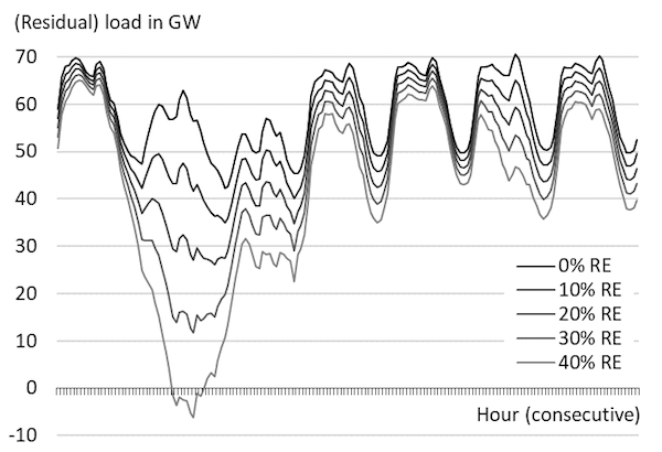
Residual load. To do this we use the concept of “residual (or net) load”, which we define as the electricity demand net of wind and solar generation:
\begin{equation} \label{eq:1} Residualload_t = Load_t - Wind_t - Solar_t \end{equation}
Figure 7 displays the load and residual load for ten consecutive days on an hourly granularity, assuming a combined wind and solar energy share between zero and 40%.
Figure 7. Load and residual load curves for ten days
Source: Own work based on data taken from Hirth et al. (2015)
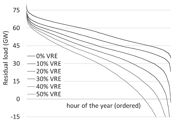
Residual load duration curve. By sorting hours by residual load, just as it was done for the actual load, we can derive the residual load duration curve (RLDC). Figure 8 displays RLDCs at different levels of penetration of wind and solar energy. While a higher penetration rate only marginally reduces the y-intercept of the residual load duration curve, the curve pivots clockwise making it steeper than the load duration curve. Note that at a penetration rate of about 20 percent, the RLDC actually intersects the x-axis. This indicates that during some hours in the year, wind and solar plants supply sufficient electricity to serve the entire load.
Figure 8. RLDC for different levels of wind and solar penetration
Key point: With increased wind and/or solar deployment, the RLDCs become steeper.
Source: Own work based on data taken from Hirth et al. (2015)
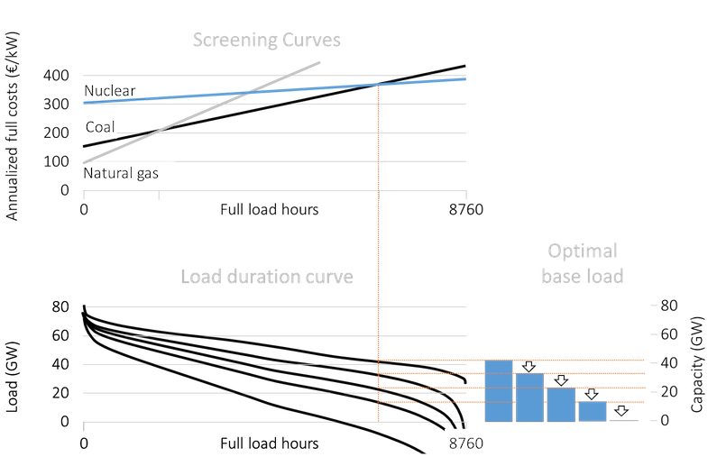
Optimal thermal capacity mix. Let’s get back to our optimal thermal capacity mix analysis. The expansion of renewable energy does change the cost curves. But the load duration curve is now replaced by the residual load curve. Further, as the amount of wind and solar power in the system increases the RLDC becomes steeper. As a consequence, the optimal thermal mix changes. The overall need for thermal capacity declines slightly (Figure 9). The optimal capacity of natural gas and coal capacity remains roughly unchanged or increases slightly. Most importantly, the need for nuclear capacity declines significantly.
Figure 9. Optimal thermal capacity mix without and with renewables
Key point: The introduction of renewable energy shifts the thermal capacity.
Source: Own work based on data taken from Hirth et al. (2015)
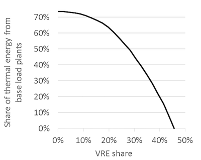
The demise of base load. Let us have a close look at the evolution of base load capacity as wind and solar shares continue to increase (Figure 10). With growing renewable energy, less and less base load will be needed. At a penetration rate of 40% to 50%, it is cost-optimal to not build any base load plants at all. Electricity that is not generated by wind turbines and solar cells is more optimally produced in plants that operate only part-time (mid and peak load plants).
Figure 10. Optimal capacity of nuclear power with increasing wind penetration
Key point: With growing renewable energy, less and less base load will be needed.
Source: OEE based on data taken from Hirth et al. (2015)
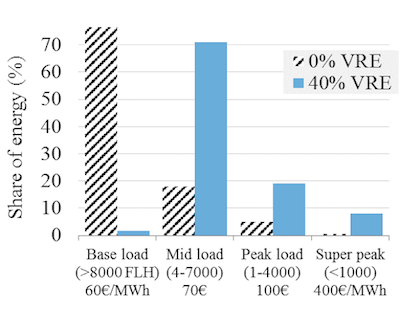
Optimal thermal generation mix. As explained above, by summing the areas under the RLDC one can determine the cost-minimal annual electricity generation mix. In the following, we discuss the optimal generation as the share of wind and solar increases. Figure 11 shows the electricity generation by plants that operate as base load plants (8,000 FLH or more), mid load plants (4,000 to 8,000 FLH), peakers (1,000 to 4,000 FLH) and super peakers (below 1,000 FLH). In a traditional power system without wind and solar energy, it is cost-optimal to produce about three quarters of all electricity from plants that run almost all the time. With growing renewable energy, less and less electricity will be generated by power stations that operate base load (Figure 12). This transformation can either imply power plants that were built for base load operation reduce their running hours or they will be replaced by plants that are constructed for mid load operation.
Figure 11. Share of electricity generated from base load, mid load, and peak load plants without renewables and at 40% penetration
Key point: As penetration of renewables increases, less electricity should be generated using base load plants and more using mid and peak load plants.
Source: Own work based on data taken from Hirth et al. (2015)
Figure 12. Share of electricity generated from base load plants (defined as 8,000+ FLH) for different rates of wind plus solar penetration
Key point: Base load disappears as renewable energy expands.
Source: Own work based on data taken from Hirth et al. (2015)
5. Scarcity or peak-load pricing model
Recap: short-run model of electricity prices. The merit order model introduced in the previous chapter was a short-run model, i.e. a model that takes the existing capital stock (of power plants) as a given. In that model the electricity price always equals the variable cost of the marginal power plant. A power plant earns short run profits if it is infra-marginal, i.e. if its variable costs are lower than the market price. But are the short run profits sufficient to cover fixed costs? Further, can the marginal power plant in the merit order never make a profit, as the price never rises above its variable cost? To answer these questions we need to employ a different, long-term perspective.
Theory. The starting point of long run price determination in electricity markets is the so-called “peak-load pricing” or “scarcity pricing” theory.
Scarcity pricing with inelastic demand. In the simplest case, let’s consider a system with perfectly price-inelastic demand i.e. demand for electricity is the same irrespective of the price. Peak-load pricing theory shows that in this case in all hours of the year the market price for electricity will be equal to variable cost of the marginal plant except in the hour with highest demand. In that hour the price rises so high that the entire annualized capital cost can be financed during this one hour. For example, if the annualized fixed cost of the marginal power plant is EUR 50,000 per MW (or EUR 50 per kW) the electricity price rises to EUR 50,000 per MWh plus the variable cost of the plant. This is called “peak- load pricing” or “scarcity pricing”, because overall capacity is scarce in this, and only this, hour.
An economic equilibrium. This is the only price level that constitutes a long-term economic equilibrium. To see why, imagine what would happen if the scarcity price would be less than the annualized fixed costs of the marginal plant: this plant would not be able to recover its capital cost. Anticipating a loss-making investment, no rational investor would build the capacity in the first place. On the other hand, imagine the price would rise above EUR 50,000 per MWh. Then the peaking plant would make a profit. This profit would attract additional investors up to the point where competition would bring the price down to EUR 50,000 per MWh, when the first plants will start to exit the market.
Scarcity pricing with price-elastic demand. It is a strong assumption to believe that electricity consumers will not react to prices that are sky-high. Let us drop this unrealistic assumption. What happens when demand for electricity decreases with the price? With price-elastic demand, scarcity pricing occurs (price rises above variable costs of the marginal plant) not only in a single hour but also on several other occasions.
VOLL. As a third possibility, let us consider a certain pattern of price-elastic demand. Let us assume that demand remains price-inelastic up to a certain price level, at which it becomes perfectly price-elastic. This happens if consumers have a fixed willingness to pay for electricity, which is termed as the “value of lost load” (VOLL). As a consequence of such a demand curve, the electricity price cannot rise above the VOLL.
Graphical analysis. Figure 13 shows how scarcity pricing works. For the analysis, we assume that there is a VOLL, i.e. there is a price level at which electricity demand becomes perfectly price-elastic but below which it is perfectly price-inelastic. Panel (1) shows the usual screening curves along with a “load curtailment” curve that shows the value of lost load from not meeting demand. The fixed costs of load curtailment are zero; the variable cost is the VOLL. While the VOLL is often regarded as being very high, in some cases it is cheaper to curtail the load than to produce electricity at any cost.
Following the screening curves and the load duration curve we can derive the optimal capacity in Panel (3). This is similar to the optimal thermal generation mix derived earlier. The optimal installed capacity consists of 45 GW of nuclear, 15 GW of coal and 10 GW of natural gas, i.e. a total of 70 GW. But the installed capacity is actually lower than the peak demand.
How does this long-term optimum capacity reflect in prices? Considering the 70 GW of installed capacity, we can derive the merit order curve or the supply curve of electricity. This is shown in Panel (4). The Panel also shows the demand curve for electricity during a scarcity period, i.e. demand exceeds supply. During this period, the price rises to above the variable cost of the marginal gas power plant, which will happen on all occasions during the year when demand exceeds 70 GW; this can be seen in Panel (5). Also during this period the marginal power plant can recover its fixed costs. When demand is lower, the price will be equal to the variable cost of the marginal plant, which may be nuclear, coal or gas depending of the level of demand as is reflected in the price duration curve in Panel (5).
Figure 13. Peak-load/ Scarcity pricing and long-term equilibrium
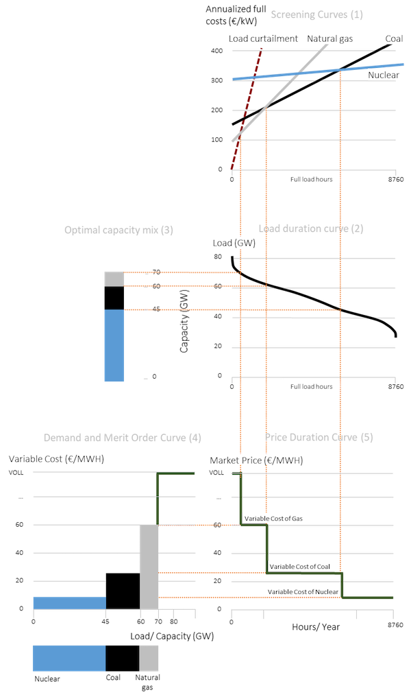
Source: OEE, adapted from Green (2005)
5.1 Insights from the scarcity pricing model
Market power. The peak-load pricing theory shows that there is a unique set of prices that is compatible with the long-term economic equilibrium, i.e. the condition that investors recover their fixed costs, but do not make any long-term profits (nor losses). It does not, however, explain in detail how the price is determined in scarcity periods. It can only rise above variable cost, because the last generator can exercise market power: it is the only supplier left with sparse capacity. Obviously, it is challenging in this situation to distinguish “adequate” scarcity pricing from “inadequate” abuse of market power.
Contestable markets. Abuse of market power is inconsistent with a long-term economic equilibrium if market entry is possible. This is the idea of a “contestable market”if profits could be earned new generators would enter the market eating up all profits. Incumbents, anticipating this, behave like price takers in spite of having market power. The features of perfectly contestable markets – no entry barriers, no sunk costs, access to the same level of technology – are moderately well-satisfied for peaking technology.
Missing money. If, for whatever reason, electricity prices cannot rise high enough to recover fixed costs, as the peak-load pricing theory suggests, investors make a loss in the long run. This concern has been dubbed the “missing money problem”. This term has caused significant confusion in the past partly because observers who had not studied the idea of scarcity pricing also used it. But there are real reasons of concern, ranging from very practical issues (for example in Germany a power exchange does not allow to enter prices above 9,999 €/MWh the online form used to place bids) to the fear that regulators might not be able to distinguish between scarcity pricing and abuse of market power. In the latter case, regulators may face pressure to cap prices if these seem unreasonable.
Further reading. Peak-load pricing theory was first published by Marcel Boiteux in 1949, an economist and mathematician that later headed Electricity de France (see English reprint of 1960). The question received considerable attention in the 1950s and 1960s, with early independent contributions by Houthakker (1951), Steiner (1957) and Hirshleifer (1958) and multiple generalizations thereafter. A useful survey of this literature is provided by Crew et al. (1995) and an accessible discussion is included in Green (2005).
Other long-term price models. The “screening curve model” introduced above is the simplest long run model of the electricity prices. Most models that are used in practice rest on the same reasoning, but include a whole set of additional constraints and features. Such models can be specified as a system of equations that is solved numerically by a computer. An example of such a numerical model is the European Electricity Market Model EMMA.